Case Study

Tammany Yacht Club

A modern website redesign that transformed an outdated WordPress site into a scalable Webflow experience, making it easier for members to stay connected and prospective members to discover what the club has to offer.
Role
Designer + Webflow Developer
Platform
WordPress → Webflow
Focus
UX • Responsive • CMS
project Overview

Reimagining the digital experience of a historic yacht club.

2015 → 2025

Tammany Yacht Club’s existing WordPress site had grown difficult to navigate and maintain, making it harder for members and prospective members to find the information that mattered most. The redesign focused on creating a clearer, more engaging experience while better reflecting the club’s community, sailing programs, events, and amenities.

The site was rebuilt in Webflow with simplified navigation, stronger content hierarchy, and a flexible CMS—making it easier for visitors to explore the club, members to stay informed, and volunteers to keep content current.


The Challenge

Outdated design, confusing navigation, and hard-to-update content made it difficult for members and potential members to find important information.

The Solution

A clean, modern design with a clear information hierarchy, intuitive navigation, and a flexible CMS that empowers the club to manage the content with ease.

The Impact

A more engaging user experience, easier content management, and a website that truly represents the spirit of TYC.

The starting point

A thriving yacht club with a website that wasn't keeping pace with its community.

01
Confusing navigation
The site’s navigation had grown cluttered over time, making important information difficult for members and visitors to find.
02
Dense information
Key content was often buried within text-heavy pages, requiring users to search through information to find what they needed.
03
Weak content hierarchy
Membership, sailing, events, and venue rentals lacked clear pathways, making it difficult to understand the club’s offerings at a glance.
04
Difficult updates
Recurring content and site updates required more manual effort, making ongoing maintenance inefficient for club volunteers.
design decisions
01

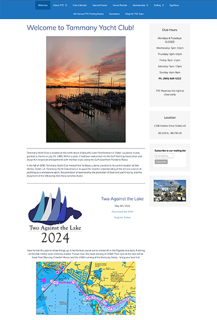
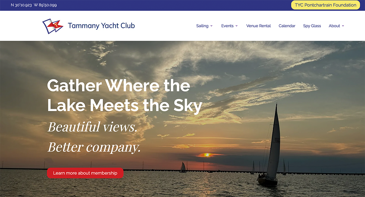
Homepage Before & After

From an outdated homepage to a clearer introduction to the club

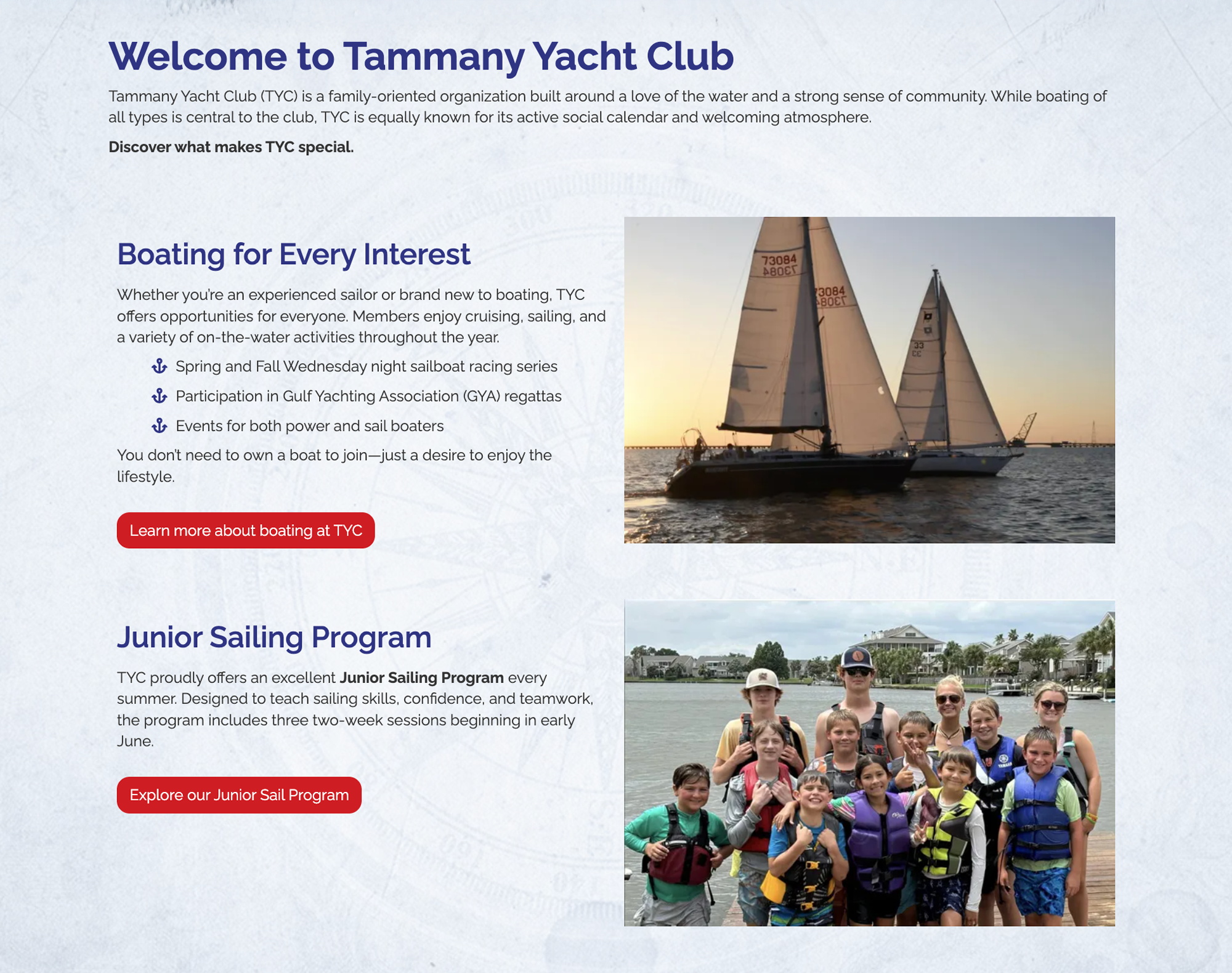
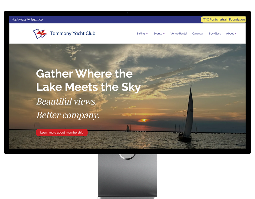
The original homepage lacked a clear hierarchy, making it difficult for visitors to quickly understand what the club offered or find the information most relevant to them. The redesign creates a stronger first impression while establishing clear pathways to membership, sailing, events, and venue rentals.

Original WordPress site
Webflow redesign
The transformation

From a dated, information-heavy homepage to a more engaging experience that introduces the club and guides visitors toward what matters most.

01
Stronger First Impression
Engaging hero imagery immediately communicates the club's atmosphere.
02
Clearer User Pathways
Membership, sailing, events, and rentals are easier to discover.
03
Improved Hierarchy
Content is organized into distinct, scannable sections.
04
Stronger Calls-to-action
Clear next steps encourage visitors to explore the site.
02

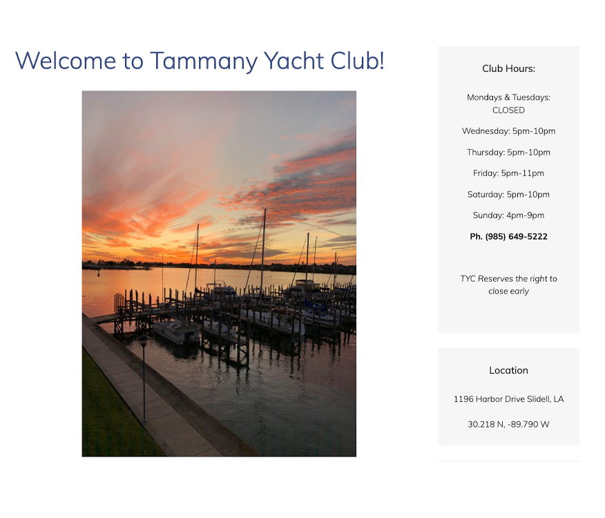
Navigation Simplified

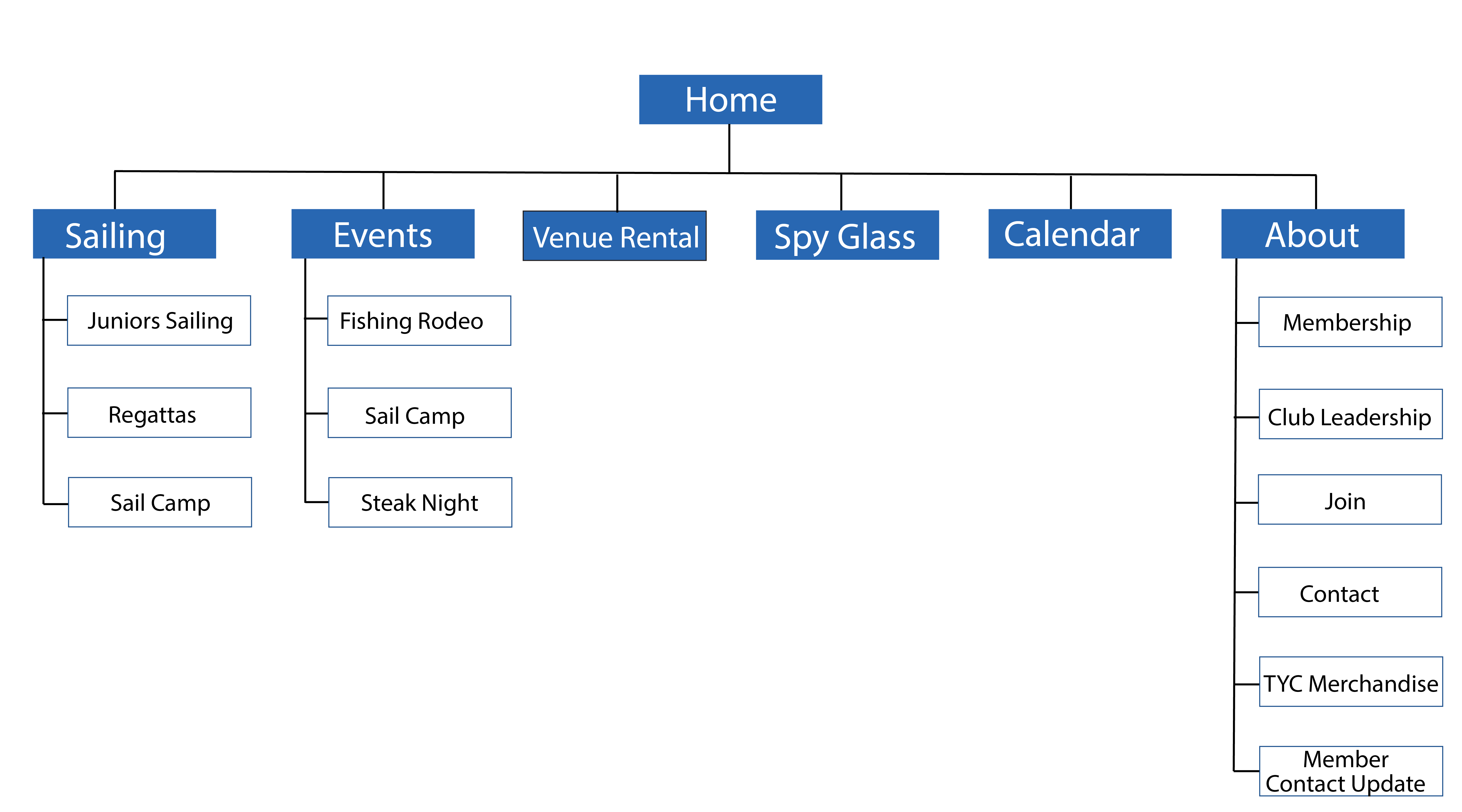
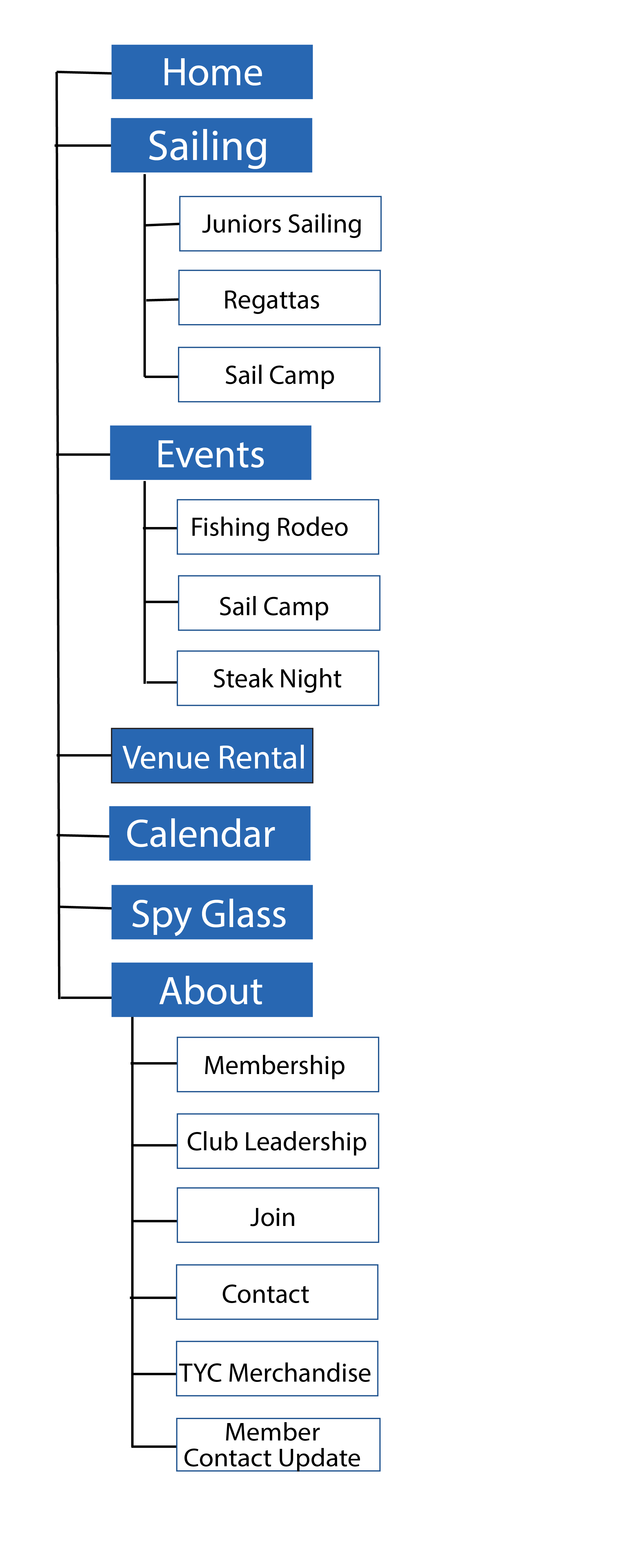
The original navigation had grown cluttered and difficult to scan. The redesign consolidates content into clear categories, creating a stronger hierarchy and making key information easier to find.

Before

↓

After
The Transformation

Simplifying the navigation created a more intuitive starting point for the entire website while giving the TYC brand a stronger presence.

01
Clear Hierarchy

Related content is grouped into logical categories.

02
Branded Experience

Club identity becomes part of the experience.

03
Easier Navigation

Fewer competing choices create clearer pathways.

03

Membership Experience

Creating a clearer path to membership

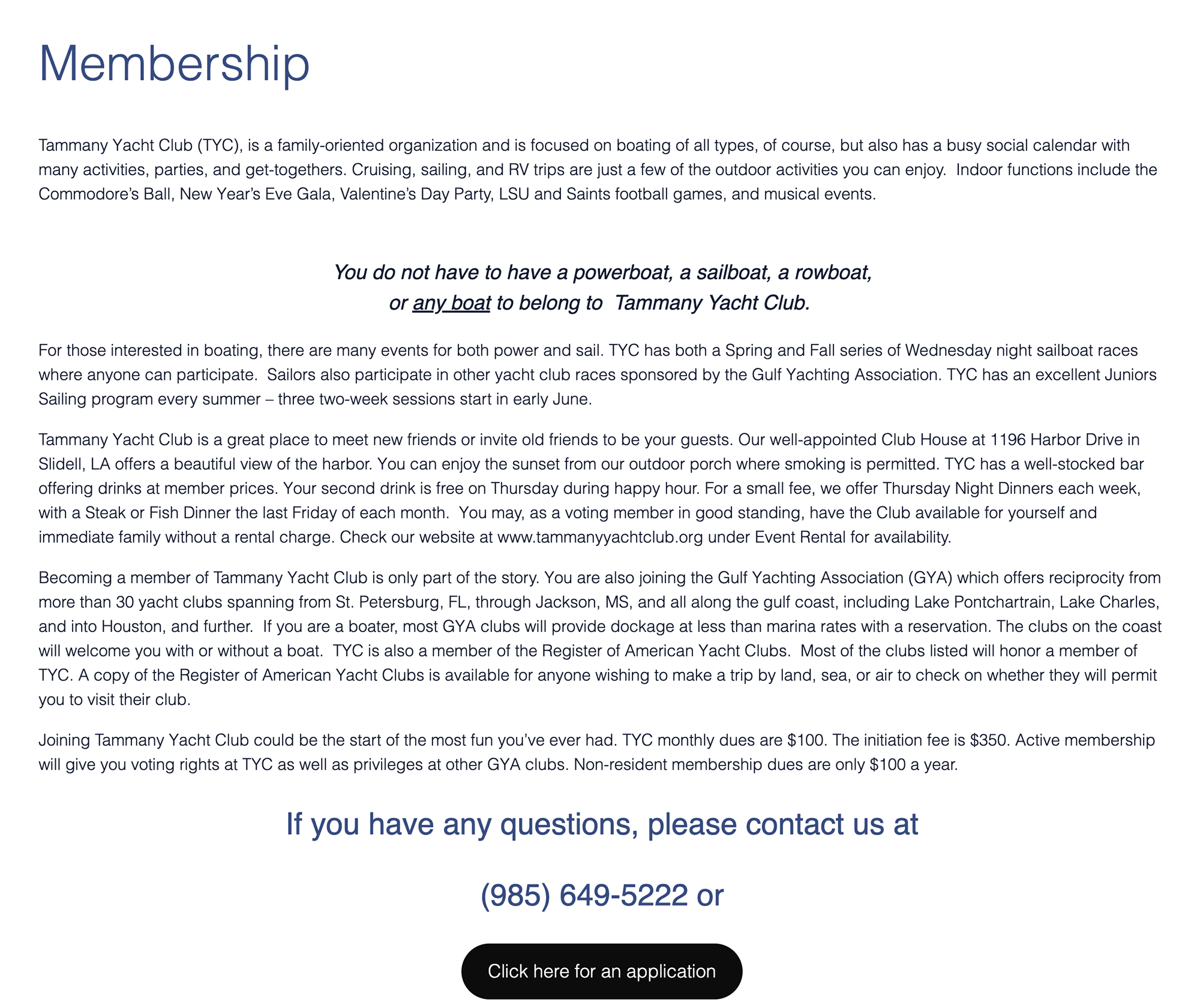
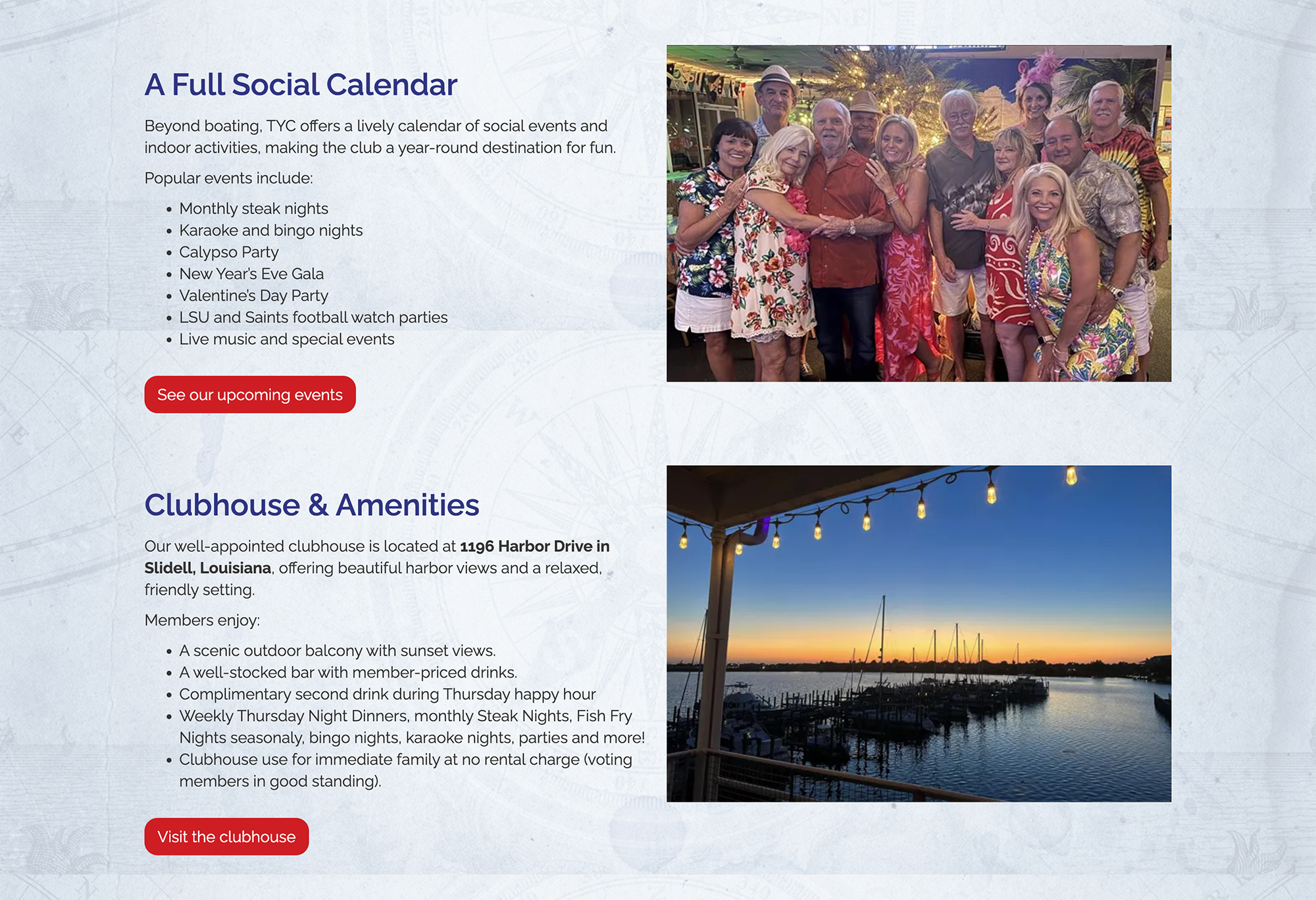
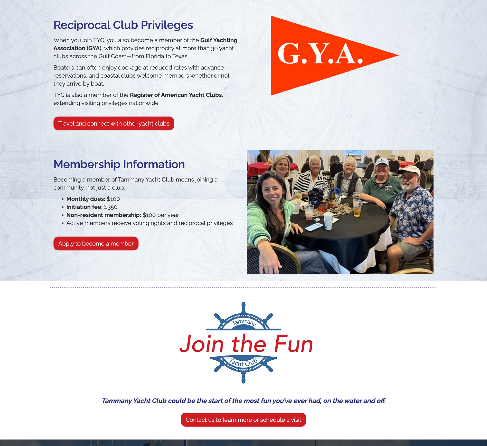
The original membership page contained valuable information, but dense content and limited visual hierarchy made key benefits difficult to discover. The redesign organizes the experience around what prospective members want to know, using focused sections, authentic photography, and clear calls-to-action to create a more engaging, scannable journey from discovering the club to becoming a member.

BEFORE
Original WordPress Page

Dense copy • Limited imagery • Buried CTA

AFTER
Webflow redesign

Clear sections • Visual storytelling • Multiple pathways

The Transformation

From information dump to membership journey.

Content was reorganized around the interests and questions of prospective members, creating a clearer path from discovering what TYC offers to understanding the benefits of joining.

01
Clear Content Hierarchy
Dense paragraphs were reorganized into focused, scannable sections.
02
Member-focused Story
Benefits and experiences lead instead of general club information.
03
Visual Storytelling
Authentic photography brings the club experience to life.
04
Clearer Conversion Path
Membership details lead naturally into a strong final CTA.

Approach

Content Strategy

The content strategy focused on helping multiple audiences quickly find relevant information while creating a clearer narrative around the club’s value and community.

Content was reorganized around key areas such as membership, sailing, events, venue rentals, and club amenities. Membership benefits were introduced earlier, highlighting the club’s community, sailing opportunities, social events, and family-friendly programming.

Navigation and content hierarchy were simplified to make information easier to find, while recurring content such as events and newsletters was structured with Webflow CMS for easier updates and long-term scalability.

The result is a more purposeful experience that clearly communicates what the club offers, who it serves, and the value of getting involved.

The Result

A website that’s easier to explore, easier to manage, and more reflective of the club.

The redesign makes it simpler for members to stay informed, new visitors to get involved, and club volunteers to keep content current, while Webflow CMS creates a more efficient and sustainable foundation for ongoing updates.